Keeping it Crafty and Quirky
Smithereenes was an illustrated greeting cards, and crafts online shop started by 2 sisters, Joy and Christine Smith (hence the ‘Smithereenes’). Furthermore, they used their platform to promote the ills of sex-trafficking as they donated a large portion of their sales to support it’s survivors. They only had a logo which went on their Etsy Store, and Facebook Page. They also would do appearances during pop-up crafts shows in NYC, but no real signage to display.
Original Smithereenes logo
Questions and Research
This was a Pro-Bono client, and I had a good amount of time for questions, research, etc. I started by asking the questions I ask all my clients, to get a better sense of their ‘story’ and feelings they want to evoke with their brand:
Who is your audience?
Give me 5-7 words to describe your brand.
How would you differentiate your company/product from others?
Are there other businesses out there that are similar in ‘spirit’ with your company?
Research and Moodboards
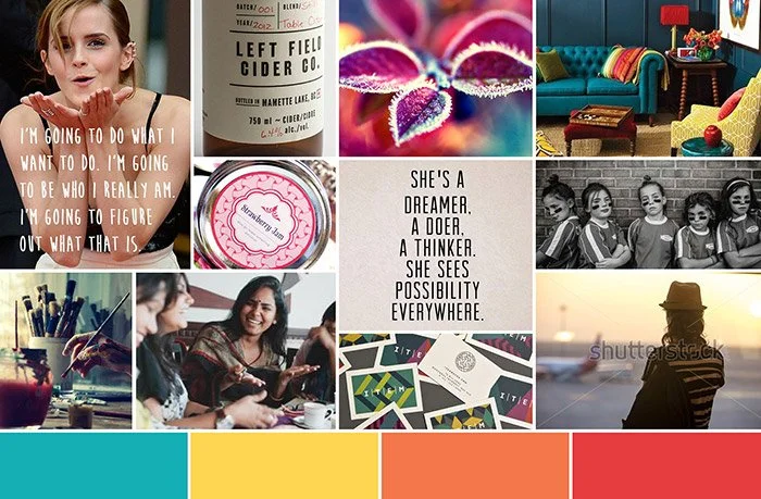
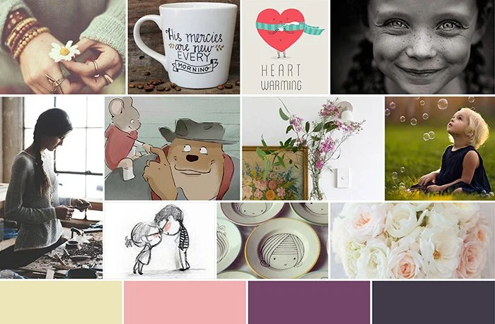
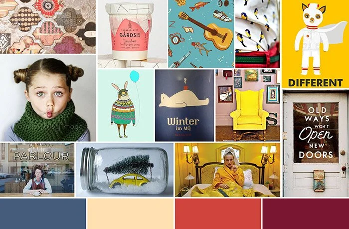
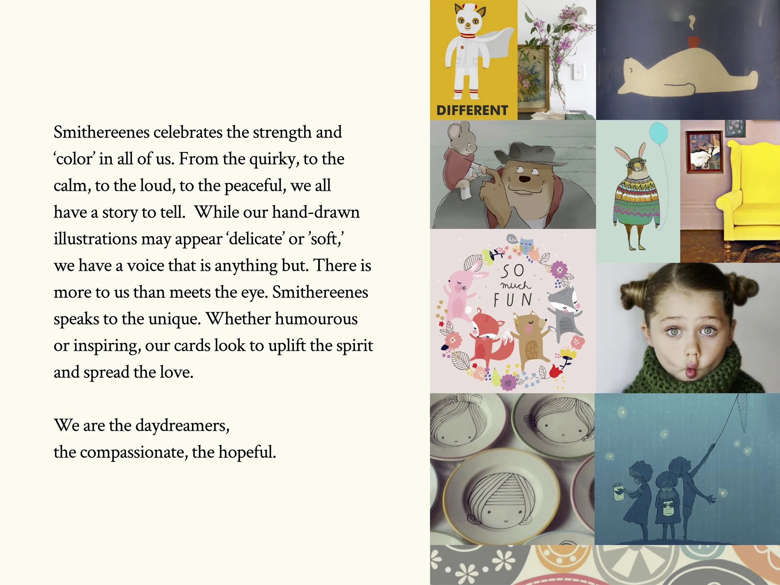
I then proceeded with mood board creations, keeping in mind their responses as I gathered appropriate images. I then continued to ‘paint that picture’ with write-up copy to correspond to each board. I find that presenting both images and copy, is the best conversation starter in getting the clients to visualize their brand.
Moodboard #1 Write-Up (Colorful)
Smithereens celebrates the strength and ‘color’ in all of us. From the quirky, to the calm, to the loud, to the peaceful, we all have a story to tell. We all have our voice...
Misc thoughts:
- bold/diverse colors…strong typeface(sans-serif)
- strong colors, to contrast the ’softer’ illustrations
- can tie in with cause(by promoting ’strength/having a voice’)
Moodboard #2 Write-Up (Cute)
With it’s lovely hand-drawn illustrations, Smithereenes speaks to the unique. We celebrate the differences, beauty, and gifts inside all of us. From the quirky and funny, to the inspiring, our designs and messages look to uplift the spirit and ‘spread the love.’ We are the daydreamers, the ’kids at heart,’ the compassionate, the hopeful.
Misc thoughts:
- plays up more cute than quirky…more romantic, more ‘awwww’ inspiring
- softer colors, to complement illustrations, and more subtle typeface (serif or hand-drawn font)
- can tie in with cause(by promoting ’uplifting the spirit/spread the love’)
Moodboard #3 Write-Up (Quirky)
Smithereenes celebrates the quirkiness in all of us. While we may appear ‘delicate’ or ‘soft’(i.e. in our beautiful hand-drawn illustrations), we have a voice that is anything but. With the use of sharp, bold colors, unique patterns, and strong, ‘spicy’ messaging, Smithereenes wants to show that there more to us than meets the eye.
Misc thoughts:
- plays up more quirky than cute…witty in the messaging
- bold, bright colors, and strong heavy typography (sans-serif)
- think ‘wes anderson’ films
- ties in well with charity??(i.e. there’s an ‘inner-strength’ in all of us, strength in numbers…)
Sketches and Logos
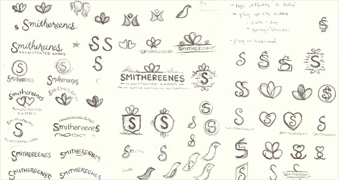
The clients decided on the direction (a mix of board #2 and #3), and I then proceeded with logo sketches that spoke to those softer, but quirky sensibilities…
Selected Design
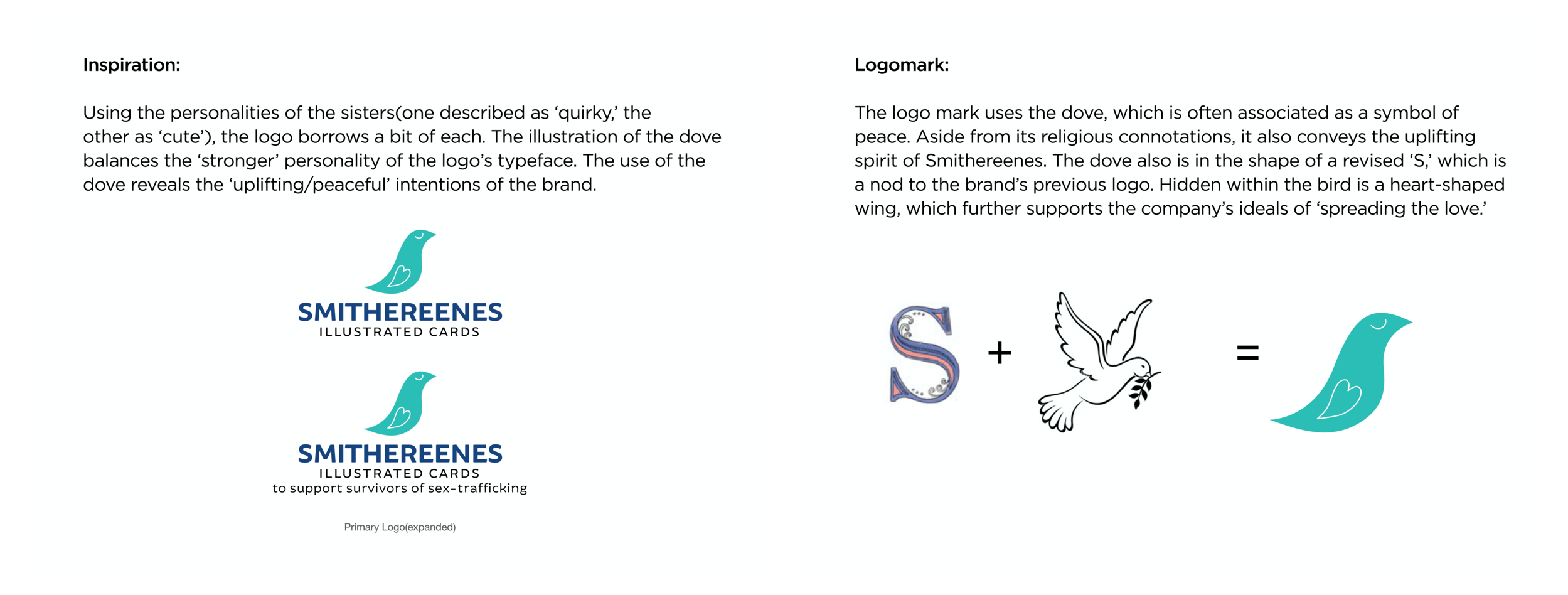
After showing the clients 3 possible logos (see full logo presentation here), all of which had design explanations, the sisters gravitated towards one that spoke to them the most.
Final Designs and Deliverables
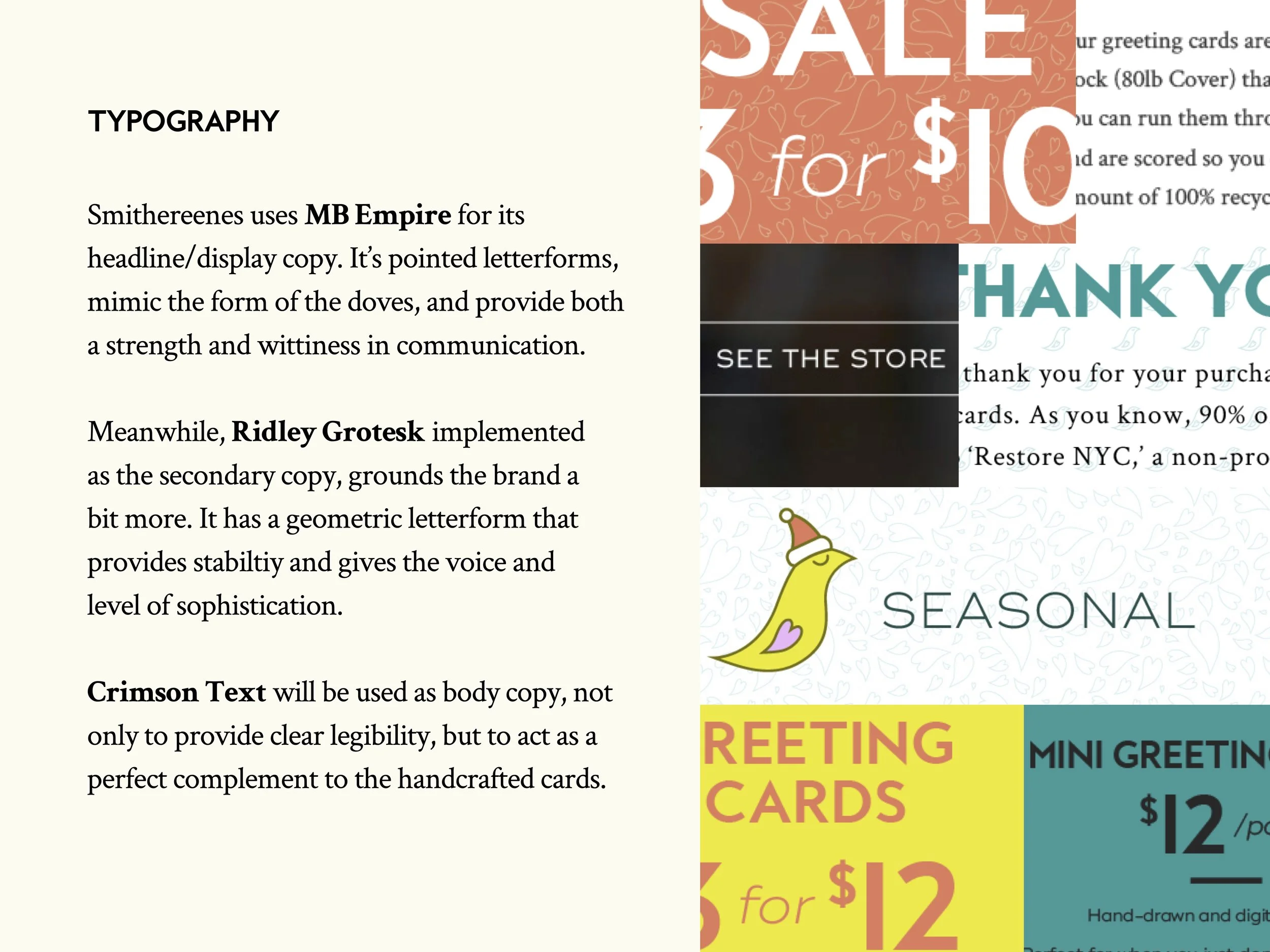
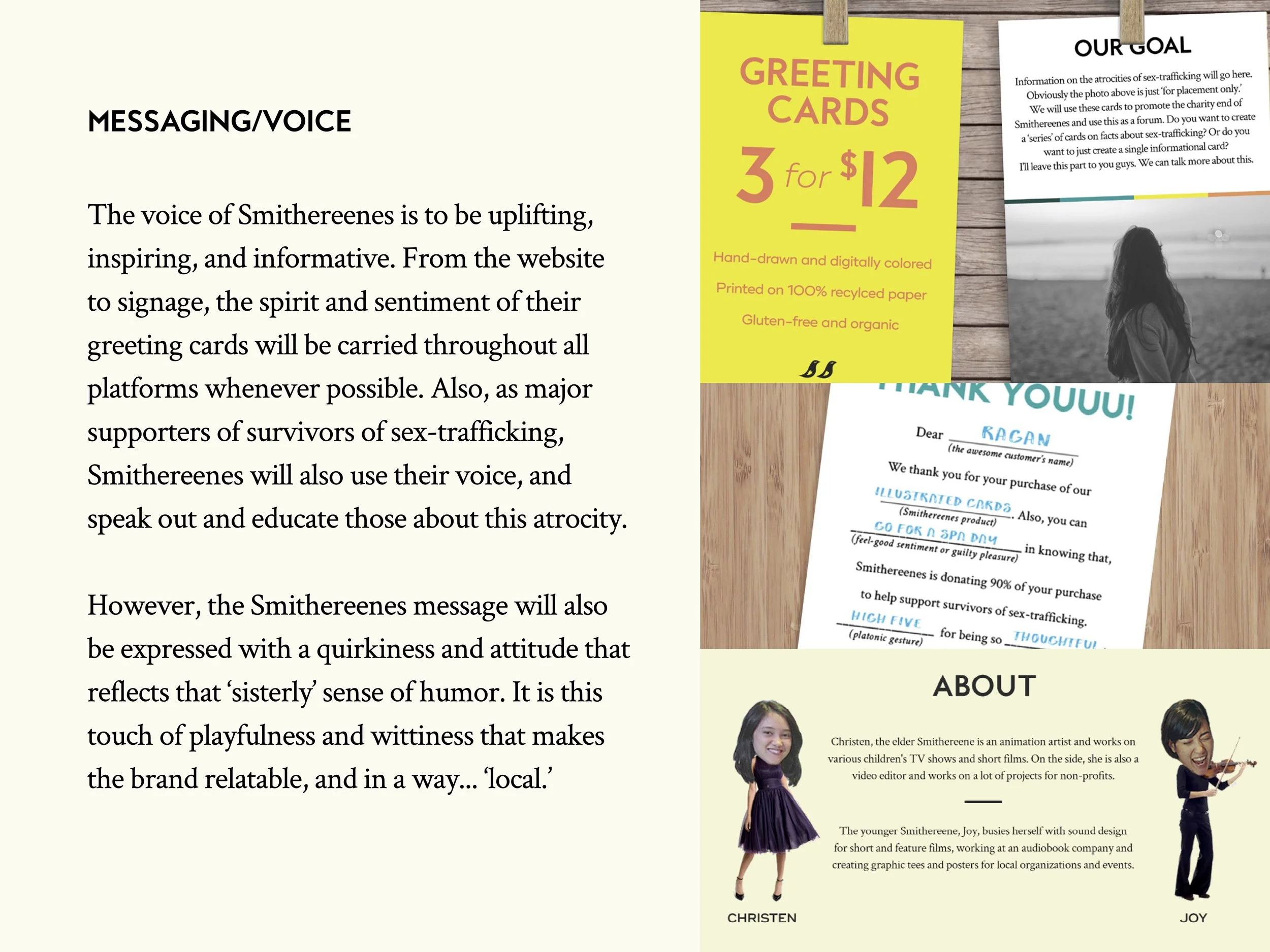
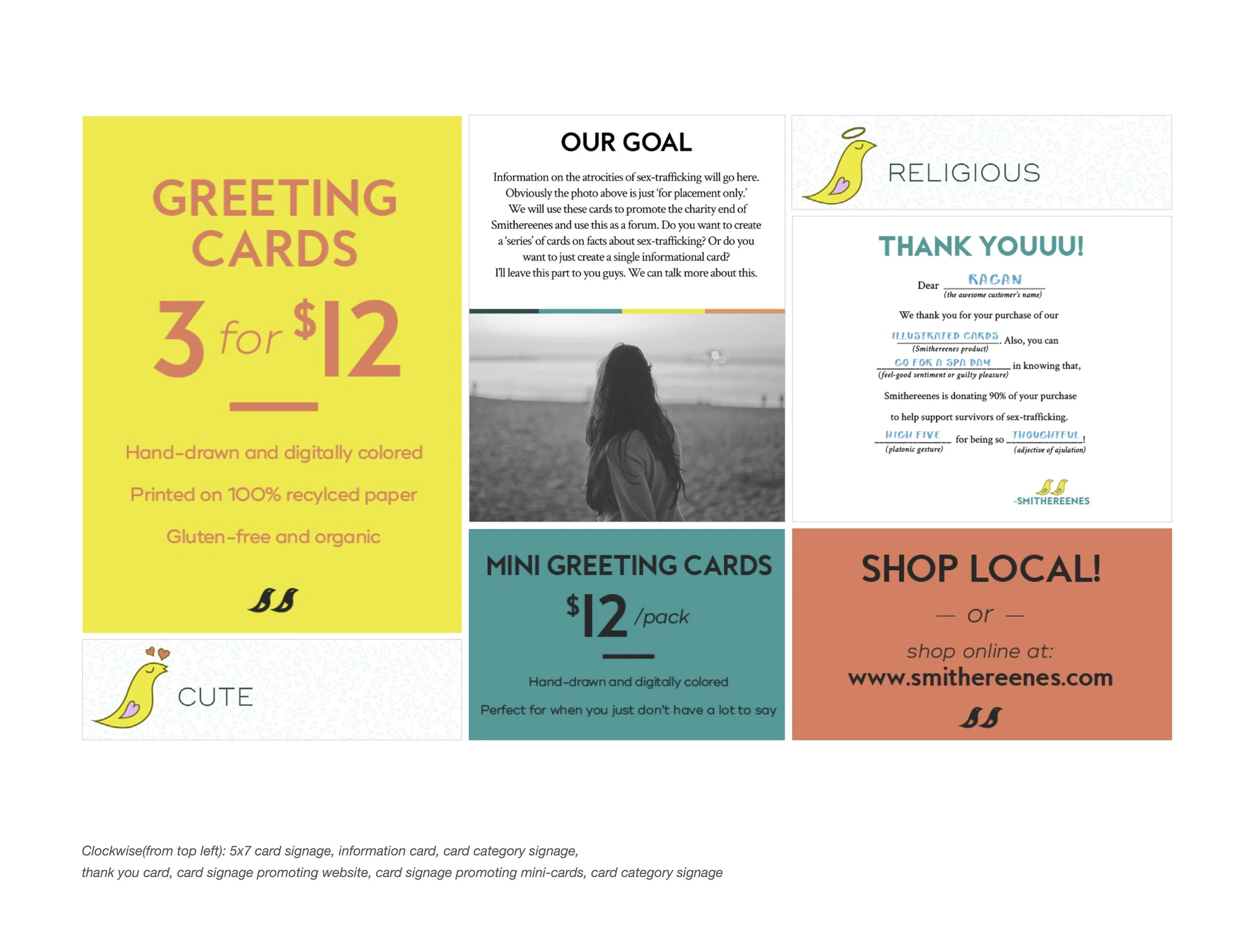
After a few small back and forth conversations (e.g. adding a second dove) and discussions on colors and final type, I delivered a final ‘brand book’ and electronic files with color palette, patterns, etc. This would serve them well for not only electronic display (i.e. etsy, facebook, etc.), but also for their actual products (e.g. signage, belly bands, etc.)


