
Getting to the Pointe
I worked with local Brooklyn fashion designer Ety Mundeke to create logo for her clothing brand, Pointe Noire. She initially hired a designer, but ultimately she wasn’t able to align with him on a final direction. I was fortunate that she had a lot of information to provide, and had a good amount of backstory to her label, which made things easier:
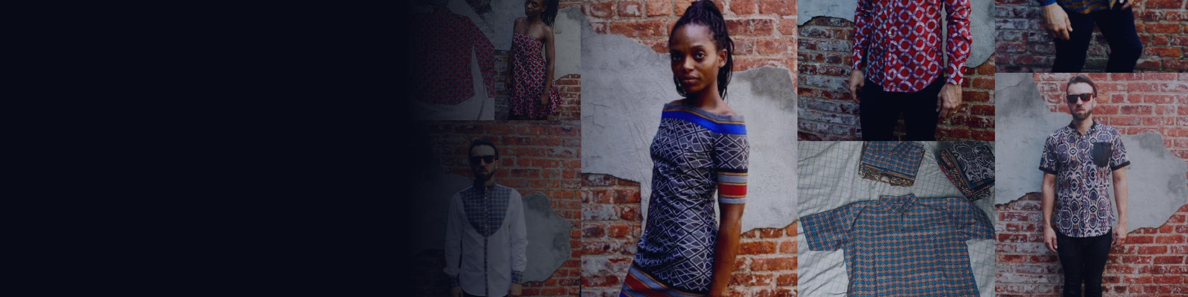
Pointe Noire is a brand new clothing label, we are currently based in Brooklyn, New York. We essentially carry a line of men’s shirt and women’s dresses, fashion accessories and house-wear. I founding the label and design all the clothes. I called it Pointe Noire cause it’s the City I was born in the in the west coast Congo-Brazzaville, so very much like tropical paradise,
Inspired by Western African fashion and influenced by european and western trends, I decided to create ready to wear designs that combine both Worlds with eye catching hue statement-make prints but still subtle using Deutsch Wax fabric and Batik two omnipresent materials.
Pointe Noire offers fresh designs with modern and classic vintage silhouettes.Our label is defined by bold prints vibrant colors.
Each pieces are unique mostly hand produce in Kinshasa, Congo, DRC, depending on main d’oeuvre availability we are using local resources and teaming with talented artisans, tailors and seamstresses.
We are focusing on helping improving their lives through work by fair trade.
We want something that stand out the crowd.
Earlier versions submitted by another designer, which the client rejected.
Research and Mood Boards
Like all branding and logo projects I’ve done, I created a mood board and a write-up, which attempted to tell their ‘story’ but at a slightly different angle.
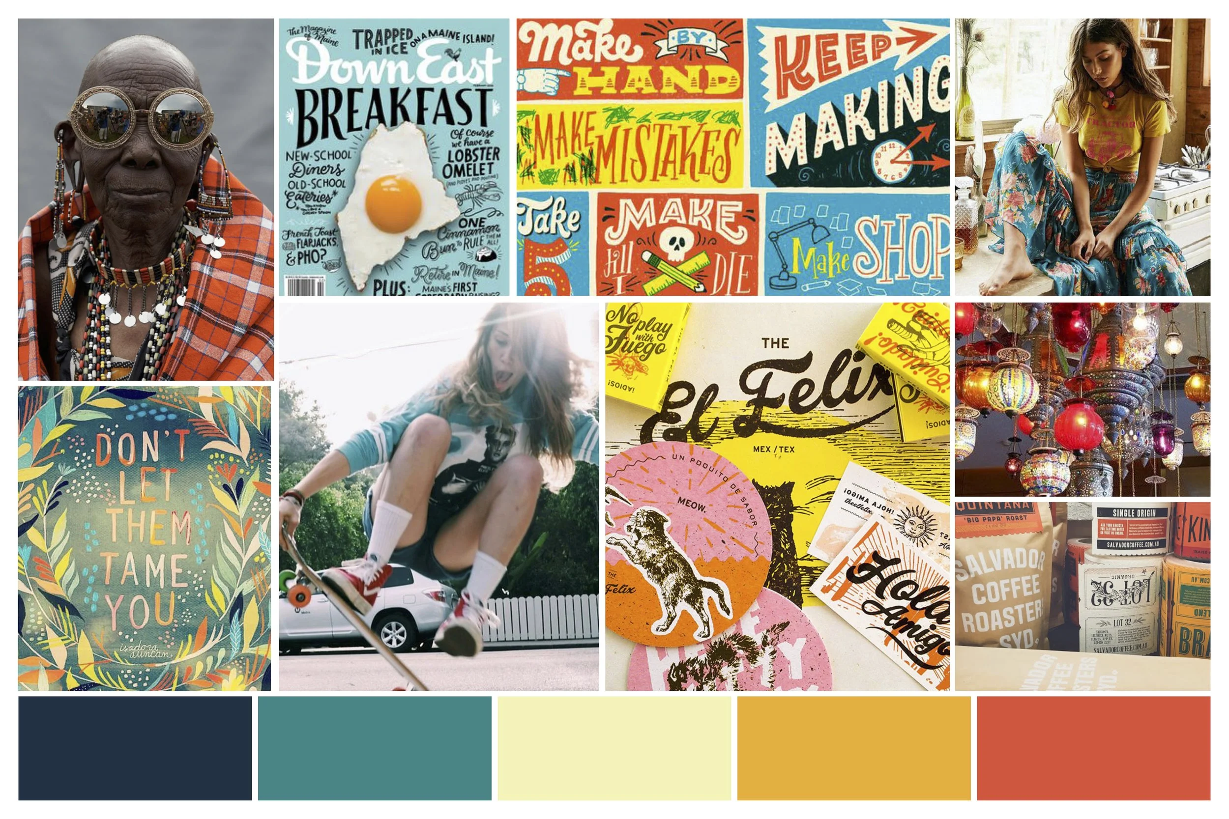
Moodboard #1 Write-Up (Colorful)
Pointe Noire speaks to our creative/fun side. We are dedicated to our craft and art and speak loudly. While our prints/designs are a nod to Western African fashion, we know that creativity and art hold no bounds, as we proudly wear our attitude on our sleeves.
Misc thoughts:
-Emphasized through bold/diverse colors and patterns
-‘Fluid’/hand-written typography
-‘loud’ messaging/visuals
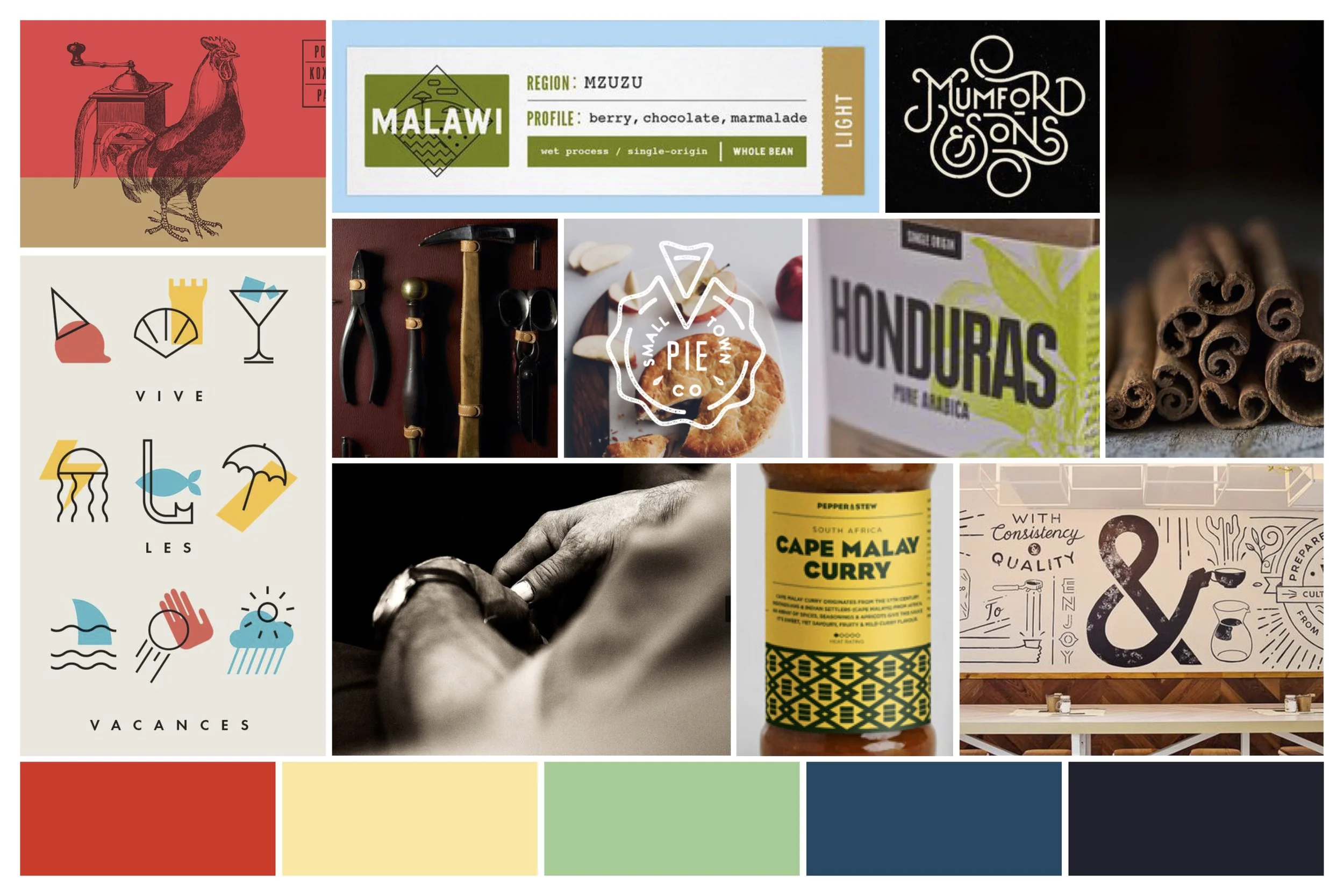
Moodboard #2 Write-Up (Dedicated)
Point Noire is a unique clothing line dedicated to the artists in all of us. Our ready to wear designs are West African/European influenced and hand-produced, as we use local resources and team up with the talented artisan tailors and seamstresses of the Kinshasa, DRC region. We are without compromise in both style and attitude, as our line is truly authentic to the region, while our designs and prints are eye-catching and bold.
Misc thoughts:
-plays up the more artisan/handcrafted look and feel
-more exacting, and precise, hence more cleaner…minimalist in design-uses more bold sans-serif typography
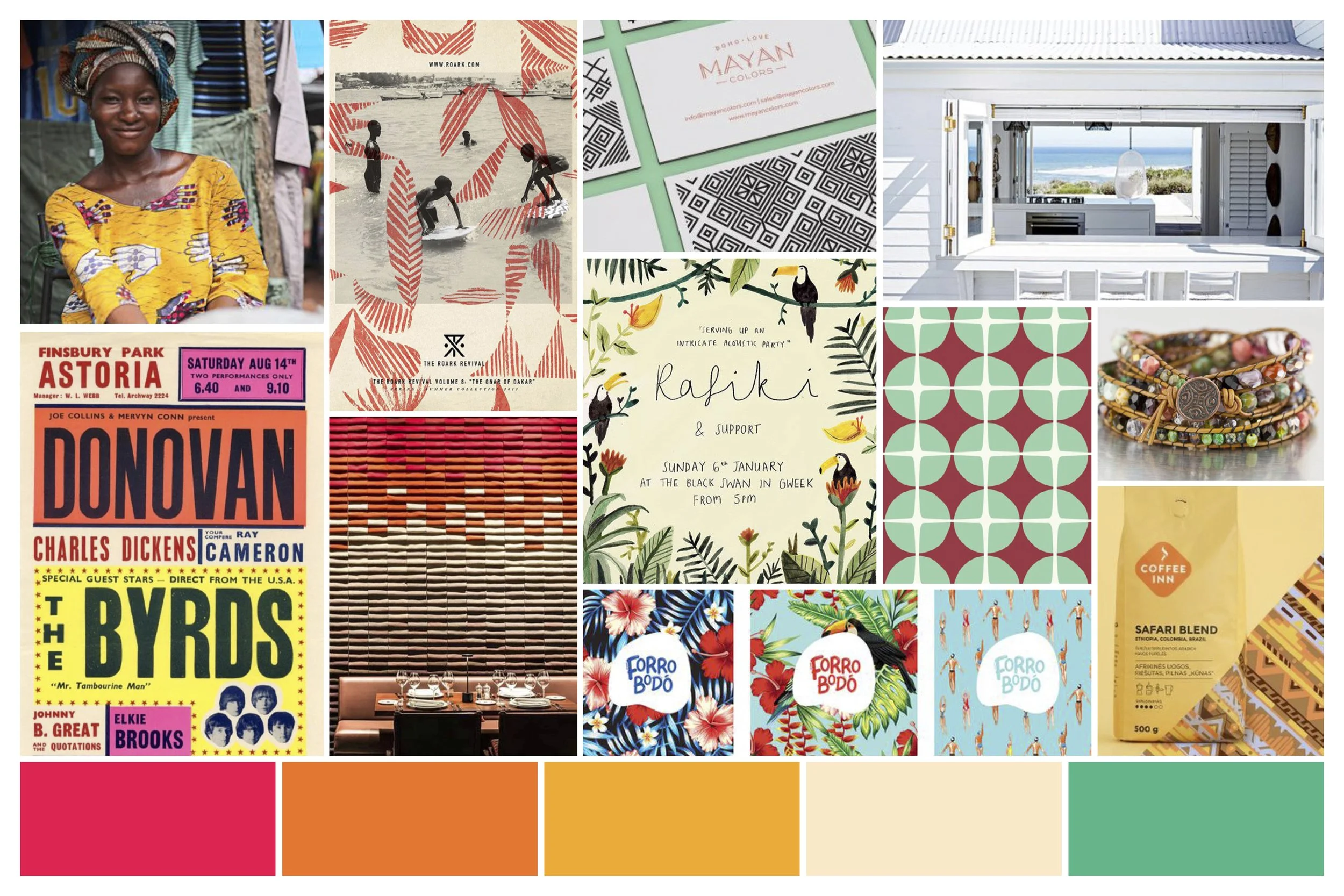
Moodboard #3 Write-Up (Traditional)
Pointe Noire is steeped in tradition. While its designs are fresh and unique, it’s influence is grounded in traditional West African patterns and trends. Pointe Noire’s authenticity also carries over to its materials, and our craft as we team up with the talented seamstresses, and tailors and use local resources to handcraft each piece. We also take care of our own, as we work through fair trade practices to help improve the lives of our artisans, making sure their efforts are rewarded properly. At Pointe Noire, we are dedicated champions of tradition looking to share our creativity through quality.
Misc thoughts:
-plays up more of the regional look and feel(through typography/ ‘local’ colors) hence, it will invoke more tropical feel (maybe more Tommy Bahama feel?)
-solid bright colors
-logo has a bit more ‘retro’ look and feel
Sketches and Logos
Ety responded to various images from different mood boards, and actually responded to both the Dedicated and Traditional write-up (moodboards 2 and 3). I was able to move forward with this in mind, sketching different options, ultimately settling on 3 options, again with each having their respective inspiration.
Final Handoff
The client went back and forth between the 2nd and 3rd versions, but ultimately settled on the 2nd version with the larger palm tree, and actually preferred a simple black and white, without any color treatments that I proposed.
Mockups of the logo to show application possibilities.