Looking for a Refresh…
I worked with writer and MMA Podcaster Chad Dundas to create an updated logo for his podcast show, Co-Main Event, that he co-hosts with fellow sports writer, Ben Fowlkes.
Original logo for redesign
Questions and Research
The clients just wanted a logo re-design. But irregardless, I still presented them with questions about their audience, describing their podcast in 5-7 words, etc. Here were some of their responses:
We don't have a ton of demographic info on our audience, but the audience is very engaged and very loyal. It is predominantly male, but we do have a fair number of female listeners as well. Average listener is probably between 30-40 years old. I would wager our audience slightly more diverse, more educated and with a slightly higher income than perhaps the "average" MMA demographic.
(When asked 5-7 words to describe their podcast) Unscripted, irreverent, hopefully smart, hopefully funny.
Because we strive to be slightly different than the average MMA podcast, in the past we've tried to avoid the cliched imagery that a lot of MMA platforms use in their logos--stuff like chain link and fists, etc.--but we're open to seeing any ideas as we try to rebrand the look of the show.
I think our podcast is fairly unique in the MMA space. We are sort of a mom-and-pop shop, not directly affiliated with any of the major MMA platforms even though Ben works for MMA Junkie and I work for Bleacher Report. On the show, we try to have the conversations we (and our listeners) would be having about the sport in private. That means we try to be honest, we try to be empathetic and smart. At the same time we try not to take ourselves too seriously. We try to laugh and joke while still be insightful, entertaining and intelligent.
(When asked about competitors) In the MMA space, I don't really think so. We modeled the structure of the podcast after the structure of This American Life (instead of multiple "acts" on each episode we have between three and five "rounds"). If I had to try to describe our spirit: Perhaps if NPR had a low brow MMA talk show with an explicit rating on iTunes? That might be close.
Research and Mood Boards
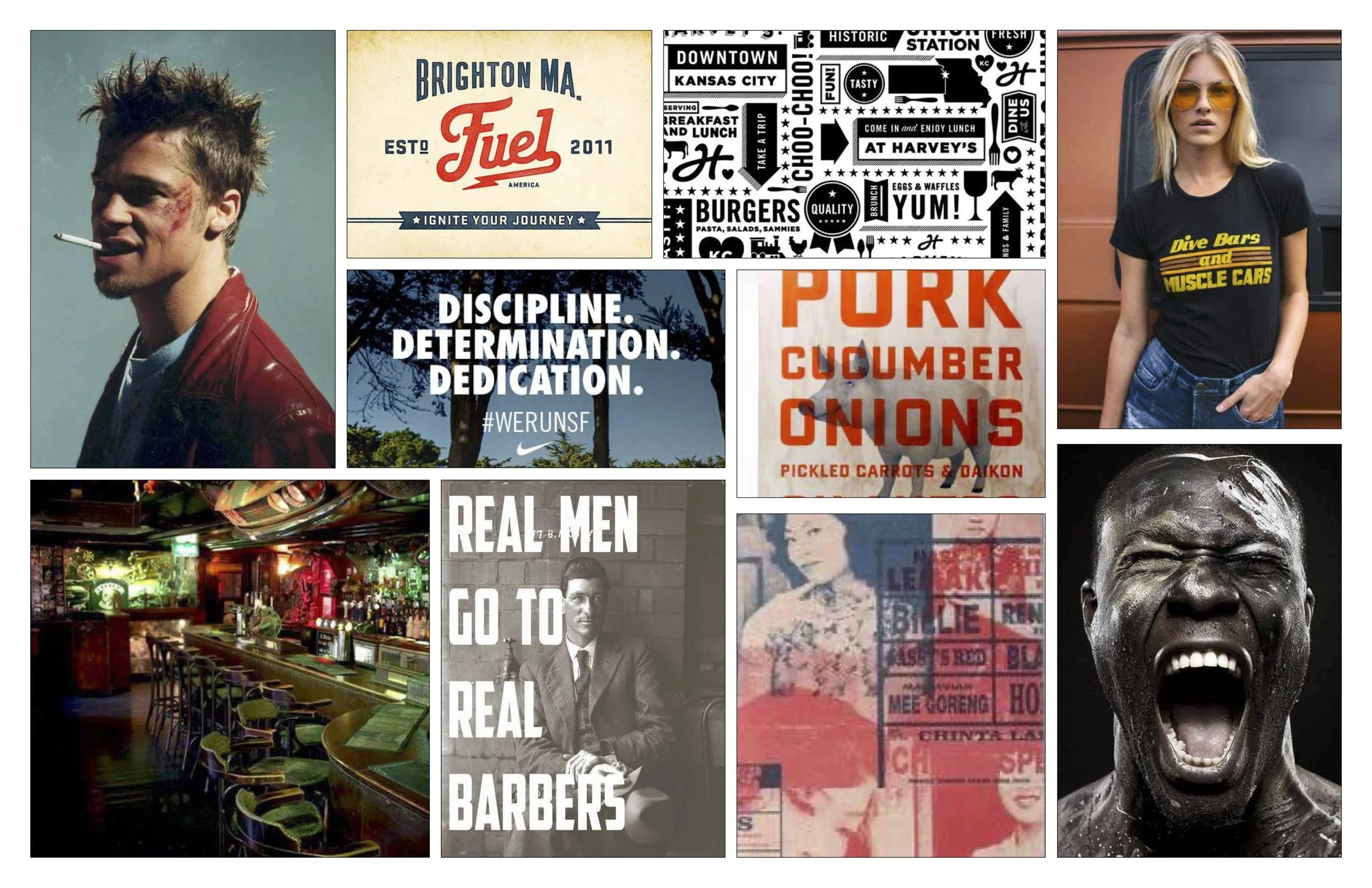
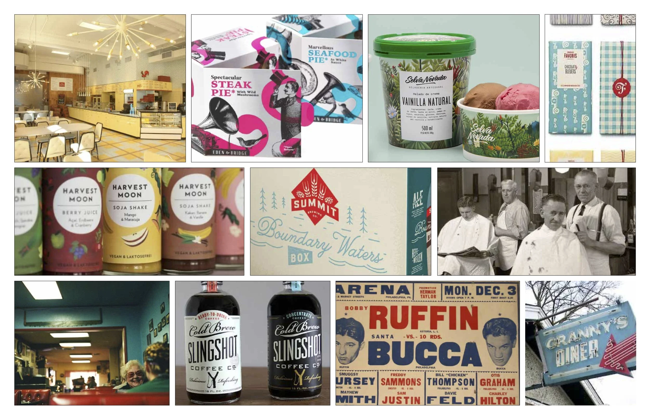
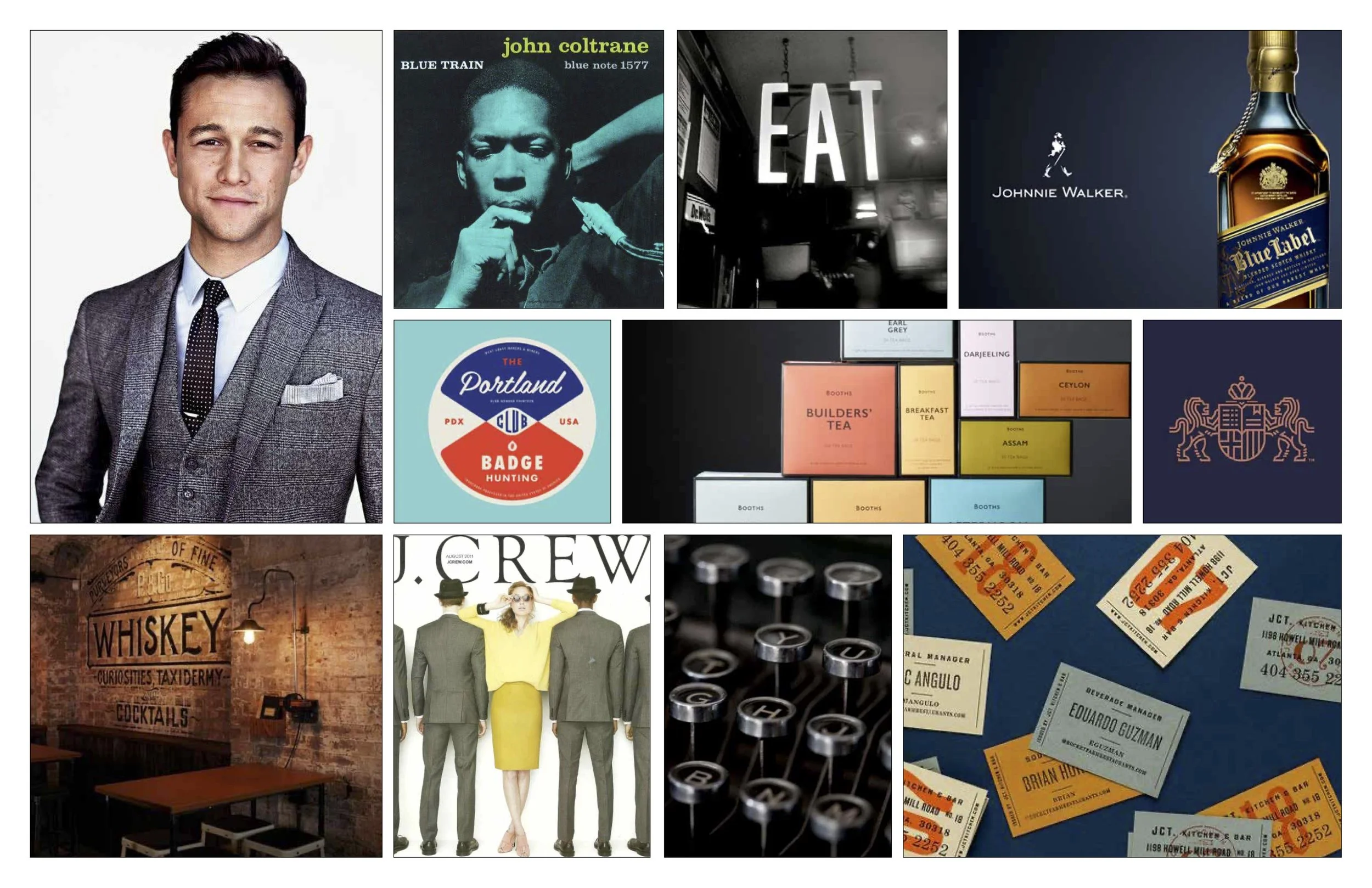
Like all branding and logo projects I’ve done, I created a mood board and a write-up, which attempted to tell their ‘story’ but at a slightly different angle. And because the clients weren’t too strict with time, I was able to create 3 boards.
Moodboard #1 Write-Up
The Co-Main Event Podcast is an MMA podcast that entertains it’s audience with unscripted, irreverent conversation about everything MMA. While we pull no punches, and our content is direct and to the point, we remain intelligent and insightful. We are engaged with our listeners, and our passions shine through.
Misc thoughts:
This angle plays up a more passionate, honest, and ‘in your face,’ look and feel. If CME could be personified it would be:
-a dive bar
-sharp, blunt words and messaging.
-more ‘raw,’ and visceral
Moodboard #2 Write-Up
The Co-Main Event Podcast is an MMA podcast that entertains it’s audience with unscripted, and honest talk about everything MMA. Think of us as barbershop patrons, or ‘diner regulars,’ where we just say what’s on our minds, but still remain entertaining engaging in the process (no inane banter here). We remain light, and keep the conversations moving..
Misc thoughts:
This angle plays up a more ‘mom and pop’ look and feel. A bit more vintage, and quirky. If CME was personified visually here, it would be:
-50’s-60’s diners
- light, and simple
- a more ‘throwback’ artistic look…less modern/graphic.
Moodboard #3 Write-Up
The Co-Main Event Podcast is an MMA podcast that entertains it’s audience with smart, engaging conversation on what is currently going on in the MMA world. While we don’t take ourselves too seriously, we still hold the sport in high reverence, and keep it classy. We don’t get ‘loud’ or ‘pound our chest,’ but rather sit back, and celebrate the sport on a more intelligent level.
Misc thoughts:
This angle plays up the more educated/NPR look and feel. Think of the podcast as more sophisticated, and ‘cool’. If the podcast could be personified, it would be:
-mellow jazz
-classy/vintage
-smooth and simple.
Sketches and Logos
After the client decided on the direction and ‘story’ (they went with mood board #3), I then kept that in mind with the mood board as my guide. I went through numerous sketches (not shown), finally settling on 3 directions. These were ultimately presented in a deck for the client, with further imagery and inspiration as an explanation.
Updates to Final Handoff
With the client selecting their preferred logo (they chose version 1), but wanted to have a few tweaks to it, such as possibly incorporating the lightning bolt, from version 2. They also preferred ‘CO’ to be highlighted, versus the ‘CME.’
Final logo in both expanded and condensed version.


