
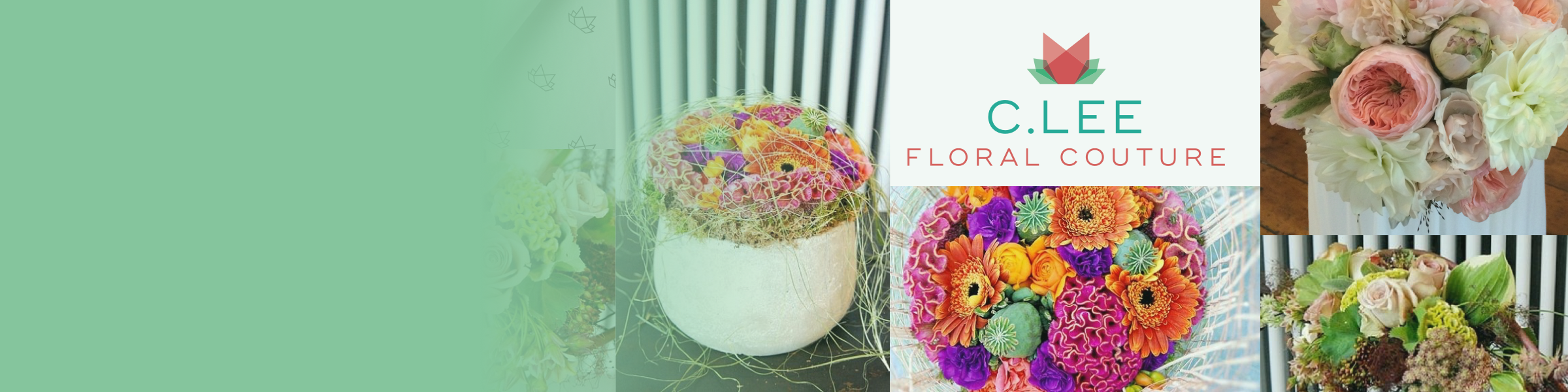
Flower Power!
I worked with local floral designer, Christine Lee to create a logo for her business, C.Lee Floral Couture. Her business was ‘floral couture,’ which was floral arrangements but at a more high-end, abstract level. This was bit of a challenge for me, as I did not know that design space (floral and abstract) too much, nor did I have a true feel for the audience (high-end, couture).
Research and Mood Boards
After I spoke with Christine, the takeaway imagery/qualities for her were:
high-end/corporate
modern
energetic
keeping it 'natural'
celebrating the form
That being said, I proceeded to create mood boards, with these images as the constant, again using whatever images I could display along with their different ‘stories’ as the driver for further conversation.
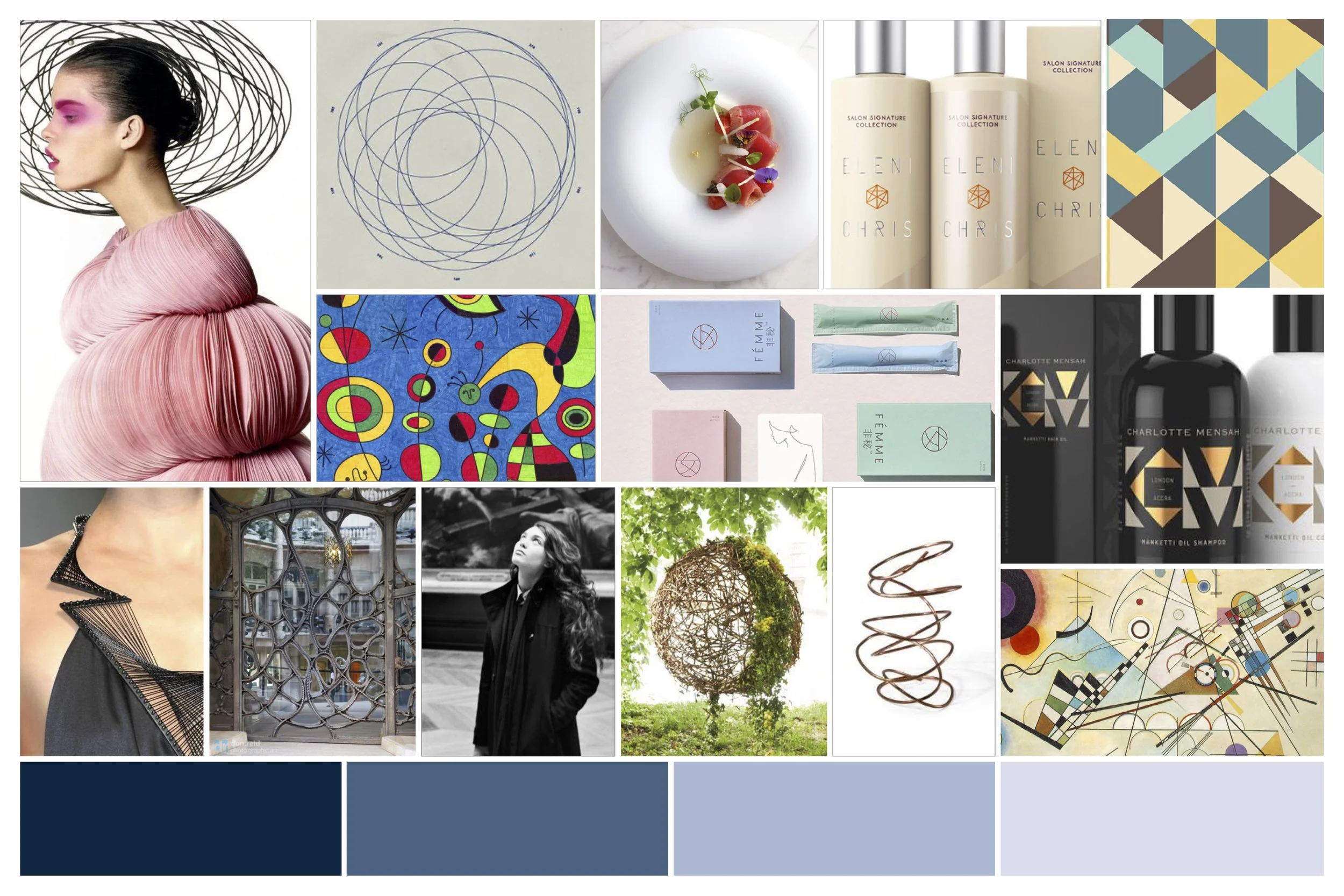
Moodboard #1 Write-Up (Abstract)
C.Lee floral couture celebrates the form and the abstract in its approach to floral design. Inspired by the works of Kandinsky, Joan Miro, and even Gaudi, our designs ignite curiosities, and speak to our ‘inner-artist.’
Misc thoughts:
-sans-serif typeface
-‘stripped down’ logo/minimalistic design to echo the approach
-light/pastel colors(or monochrome?)- We could go more bold in colors(in keeping with the Kandinsky/Gaudi/abstract influence) but in order to stay more ‘corporate’/high-end I feel toning it down is more appropriate
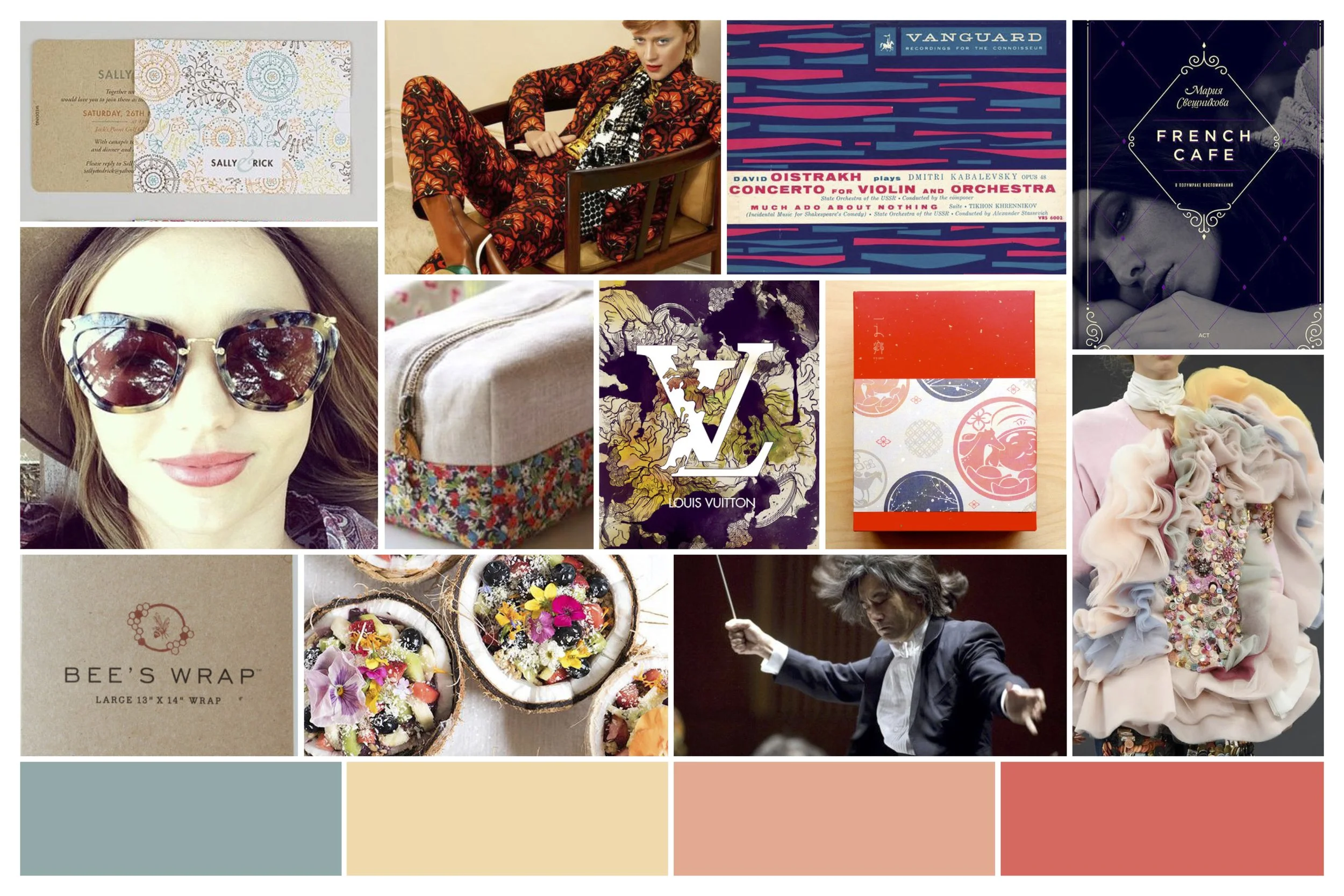
Moodboard #2 Write-Up (Colorful)
By embracing the variety of forms within floral design, C.Lee floral couture design intends to express this energy and the visual appeal of it all. Using bold, colorful arrangements, while ‘keeping it all natural,’ there is a rhythm and balance to our designs that sets the mood.
Misc thoughts:
-designs will be a bit less abstract…a bit more ornate to emphasize more of the overall visuals of the arrangements.
-maybe we try an elegant serif font here?
-more ‘floral’ looking in its approach/design
-bold colors/pattern
Moodboard #3 Write-Up (Minimal &Light)
C.Lee floral couture design is all about preserving the form in its arrangements. We keep the mood light and colorful in playing with nature’s structures
Misc thoughts:
-sans-serif typeface -bright colors
-still keeping things ‘stripped down’ (think ‘design within reach’/CB2...so maybe a bit more ‘commercial??)
-a bit more light and ‘airy’
Sketches and Logos
Christine responded to the mood boards highlighting a few images that spoke to her. While images were selected from different boards, there was still enough for me to continue with sketches and logo designs, ultimately leading to 3 conceived pieces with their respective conversation pieces.
Final Handoff
Christine ultimately settled on version 1, in fact keeping the initial proposed colors. Since the ask was just for a logo design, I sent her just the final digital file, but also a few patterns, and ‘application inspirations’ as some ideas.
Mockups of the logo to show application possibilities.