
Aligning Users & Merchants
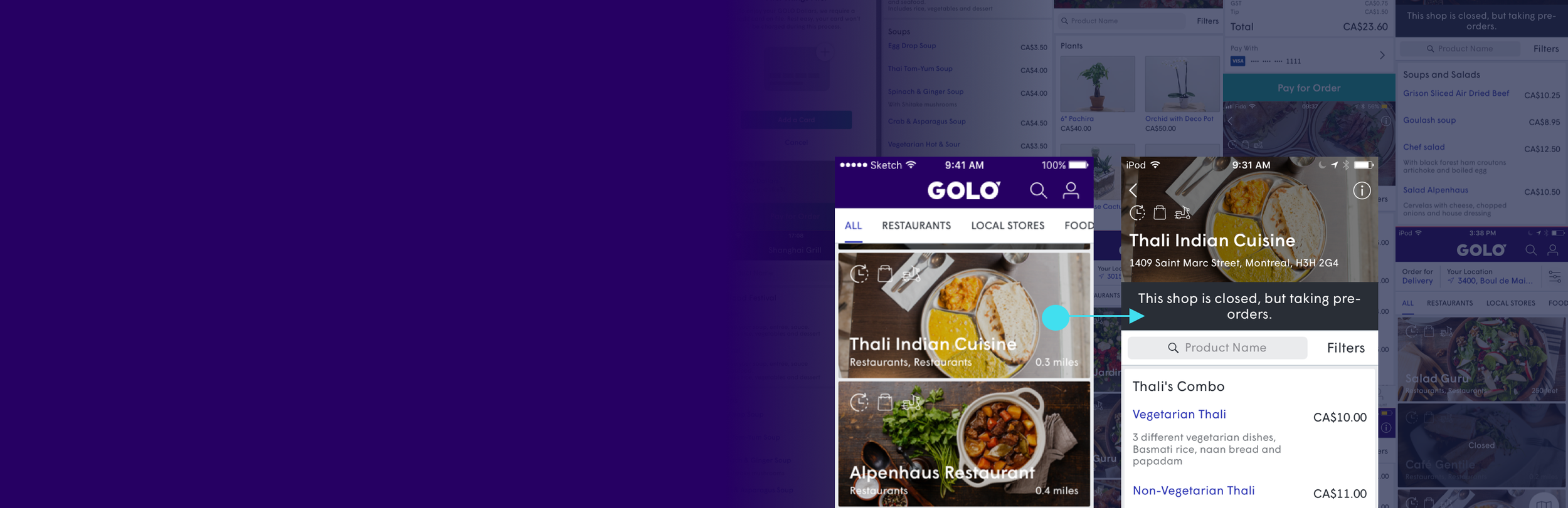
Users find shops being closed, but merchants consider them open.
How do we get them on the same page?
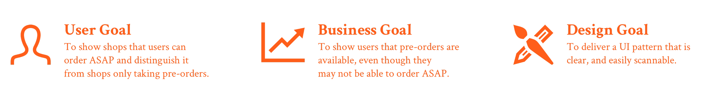
But a few other considerations to keep in mind. Before jumping into to the problem-solving and design, it was important to remind myself of the other pieces to the puzzle…
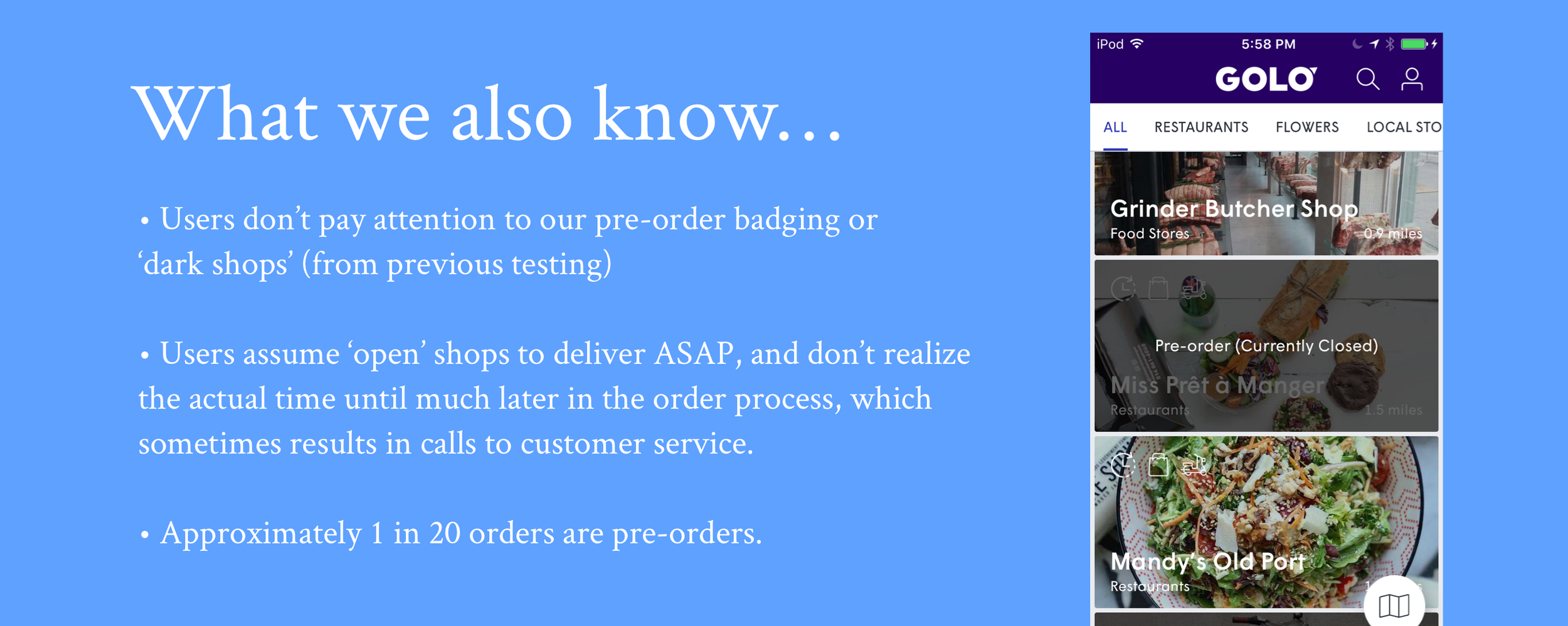
Research (Is There Anything We Know?)
As part of the process, I looked for any existing data from our Business Analyst, Customer Service, etc. and other testing results which could be useful. A few other things we found out…
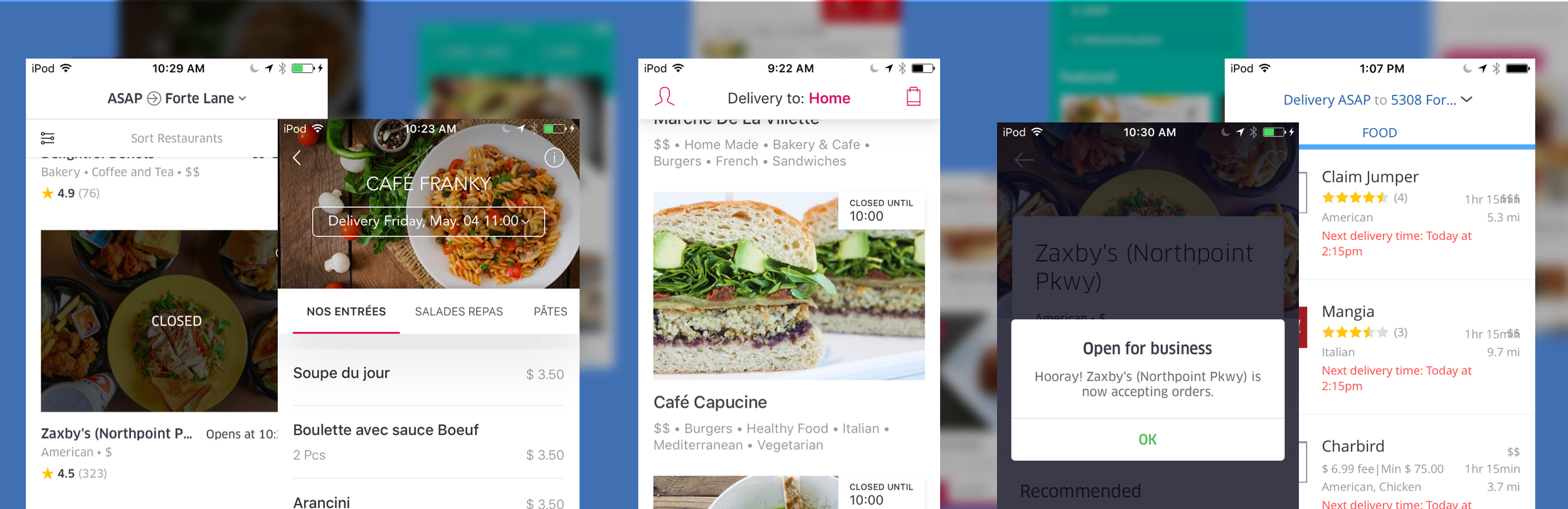
Benchmarks
After identifying the problems and defining the goals, I next went through benchmarks of several competitors to see how they handled the problem, leaning on a few UX and I patterns our demographic are familiar with.
Iterations & Rapid Prototypes
After doing a thorough investigation, I then applied similar UI/UX patterns to our app. I went through a few iterations along the way, after reviewing designs with fellow designers, including guerilla testing prototypes(via InVision) with other non-designers(marketing, developers, etc), to see if my design assumptions proved to be correct.
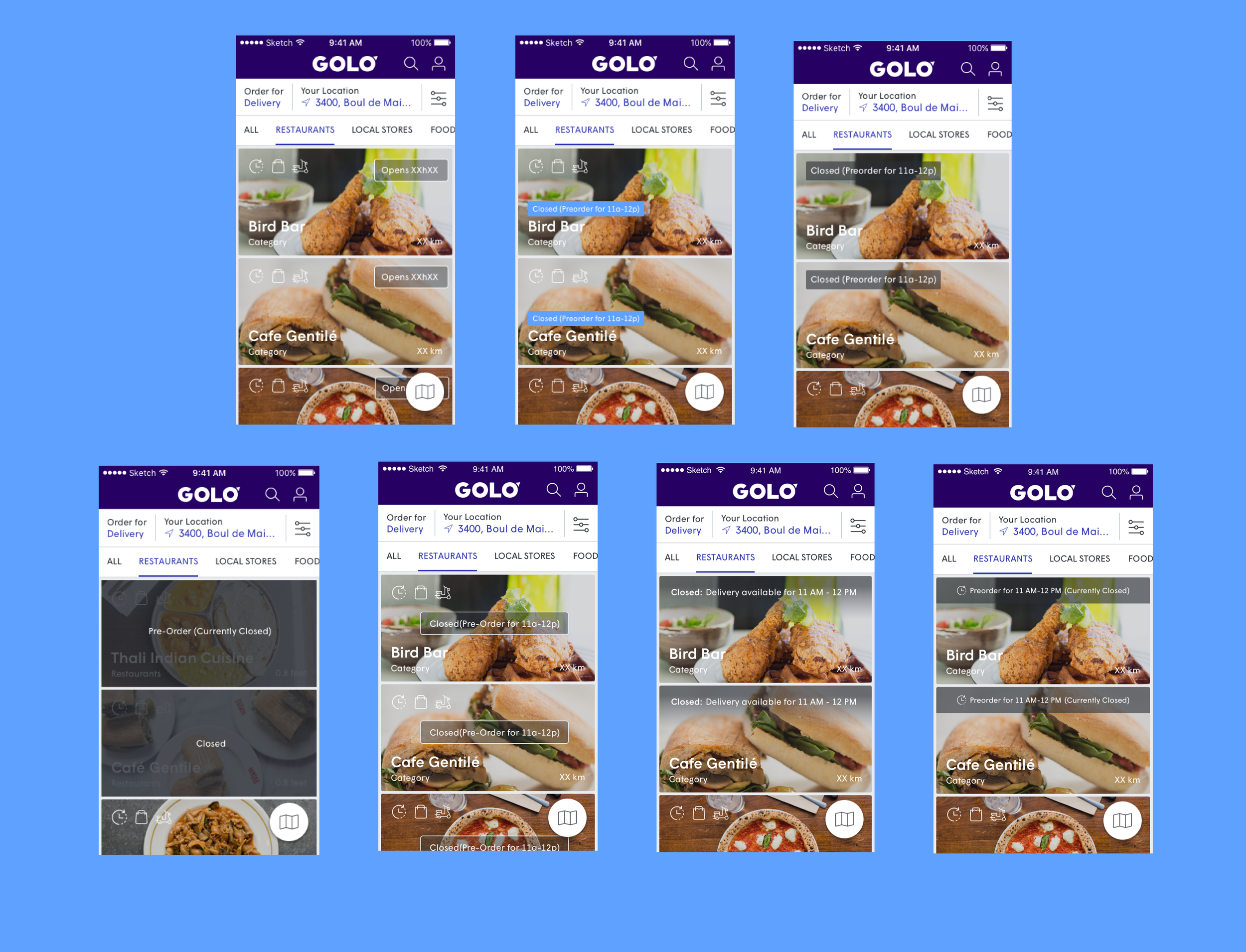
Numerous iterations made to find the proper UI, including UX Copy of ‘Pre-Order,’ as that was also a concern as to what that term meant for the user.
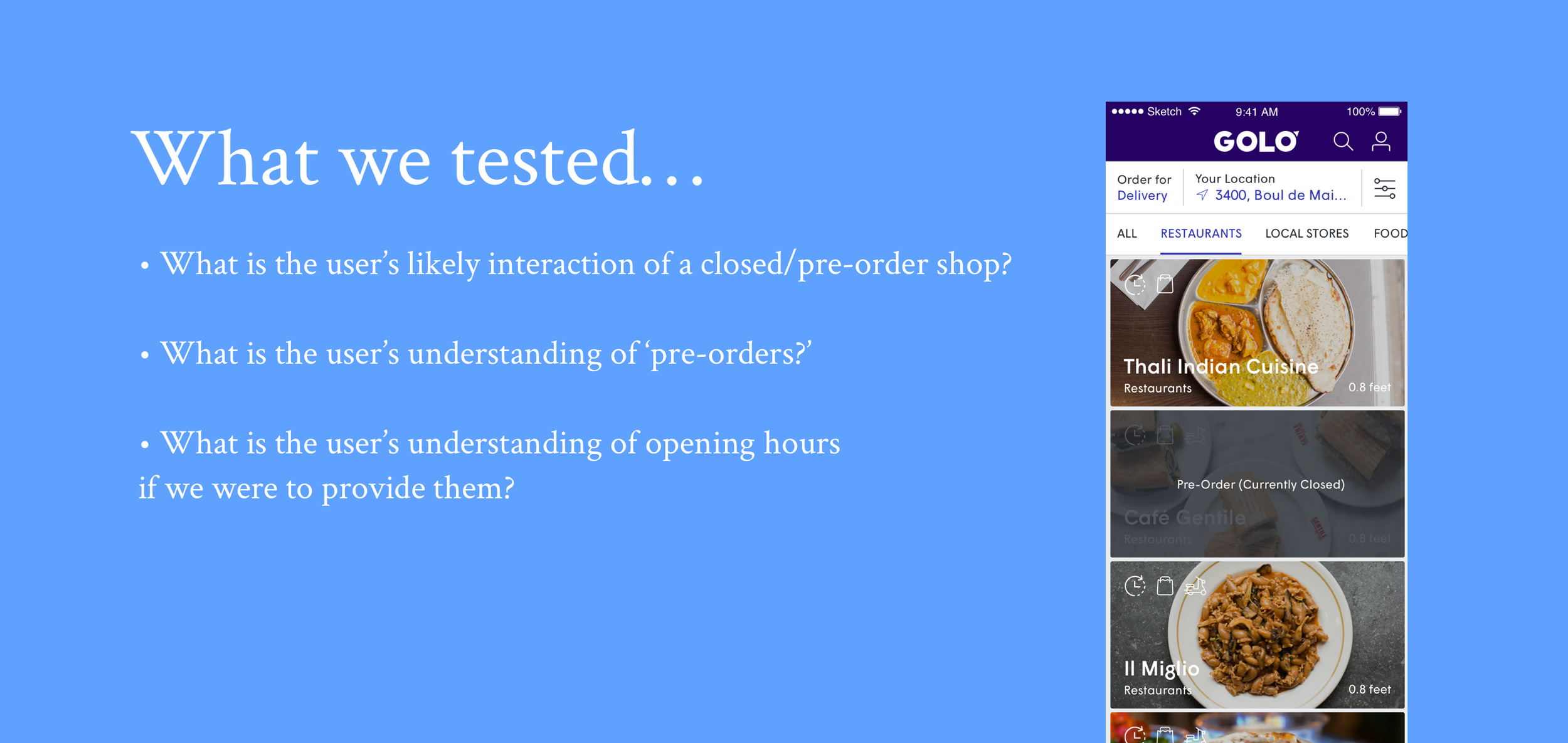
Usability Testing
To put our designs and assumptions to the test, we brought in a few outside subjects for usability testing to see if they could perform a few tasks using our updated designs.
Testing Results
Based on user feedback, several adjustments were made both on the shop page level, as well as other areas of the app that users would lean on to complete their tasks.
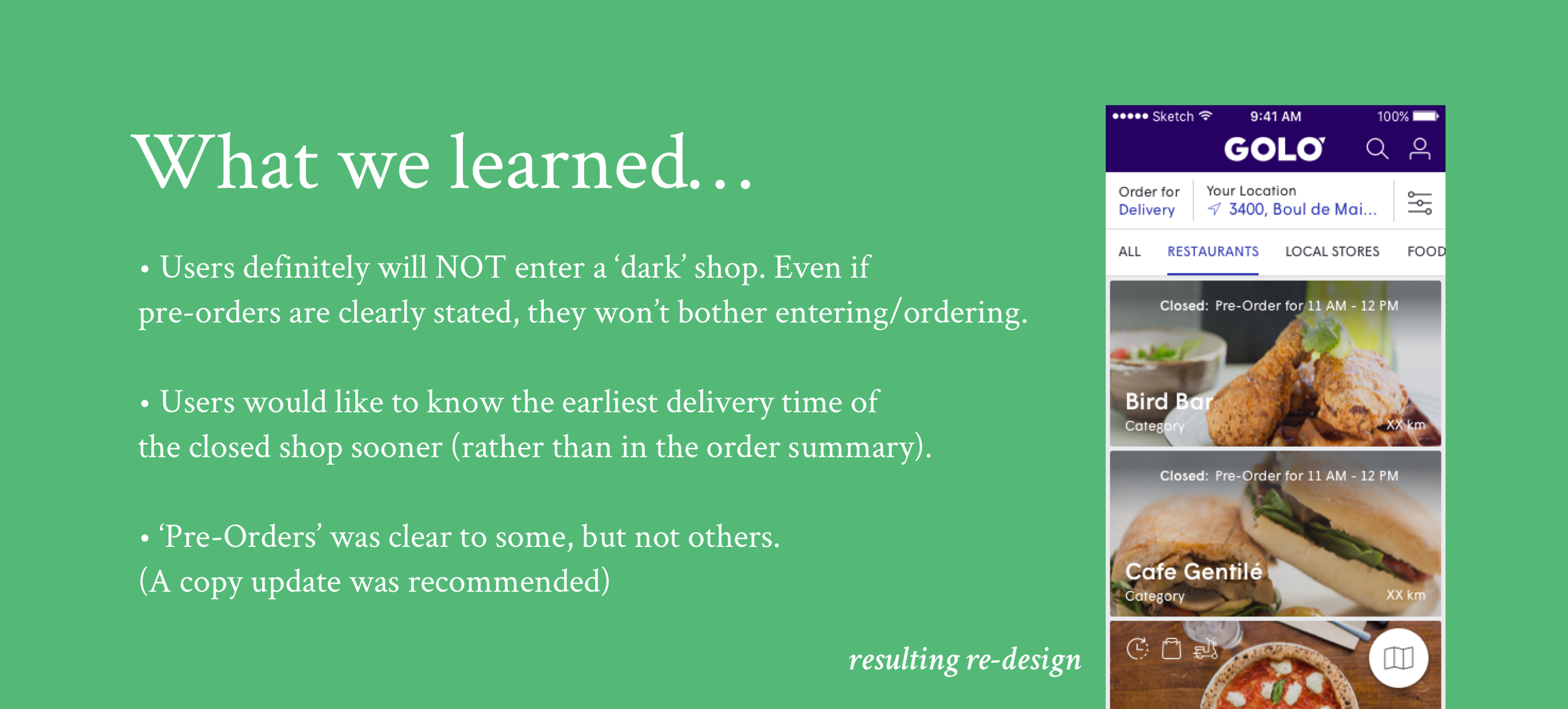
Resulting Data/Actions
Based on the re-design (via results of user testing), we were able to achieve success for both the user and merchants, which even contributed to helping out our customer service team.
Using a UI pattern of a gradient overlay to define a ‘closed(but open for orders)’ shop, allowed merchants to maintain visibility to its users (as previously they were treated with a dark overlay).
The first available hours of delivery were now shown earlier on the shop list level to avoid customer frustration.
Overall decrease in orders unknowingly placed for later, which translated to decrease in calls towards the shop and customer service for inadvertent orders.